Visualisation
On this page I illustrate some examples of data visualisation that I have used recently for the QC of real projects. Often visualisation is used so that an overall understanding can be gained of the data as a whole or one of its subsets. Once one understands the data then it is possible to either derive the cause of the problem or to know within the data set where to go to fix it.
SBP navigation errors
Often fixing the data requires traditional tools. For example, when fixing seismic data headers one might use the hugely useful application Seisee (from dmng.com but seemingly no longer available). SBP data typically contains a large number of traces (typically thousands) due to its high frequency of acquisition. Identifying incorrect navigation such as duplicate headers or mal-assigned coordinate values can be problematic.
If there was a method of rapidly looking at a line and instantly determining if and where the problem was that would at least be a start to narrowing down where the fix should be applied. The script I use directly loads a SEGY file and inspects the coordinate headers in-situ; there is no need to export navigation or perform some other manipulation. For processing of many lines see the Note.
The plot below shows a track plot of a single SBP line. The line has about 2600 traces and is approximately 600m long. The trace spacing should be about 0.25m (ping frequency approximately 4Hz).
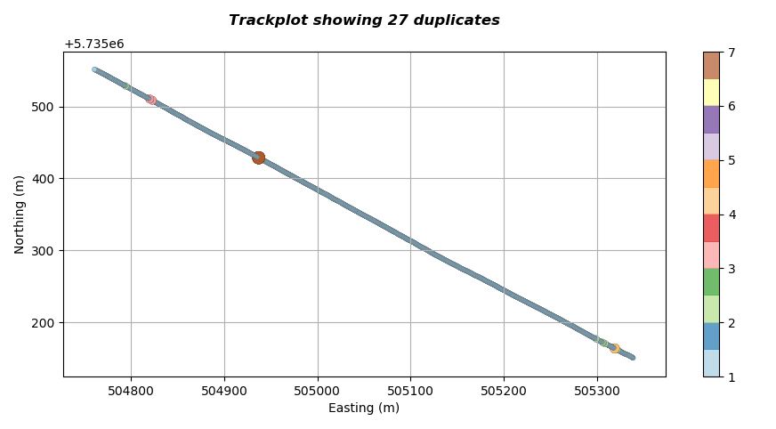
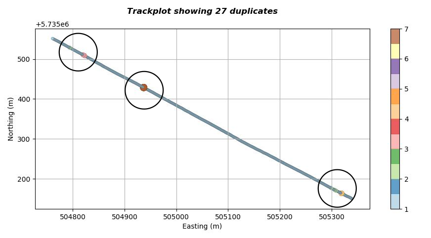
The script producing the visualisation has identified that there are 27 duplicate points within the SEGY headers and has included this in the title of the plot (so we know instantly that this line needs further QC). Additionally the script has plotted each coordinate point a different colour and size depending upon the number of consecutive duplicates it has encountered along the line. In this case we can see that there are three clusters of duplicates as indicated in the figure below.
We can use the script to zoom into the line to get a better understanding. The image below shows a zoom of the upper left cluster. Now we can see the individual points more clearly. The script has identified two locations where there are three consecutive repeats and on location where there is a repeat of two, as indicated below.
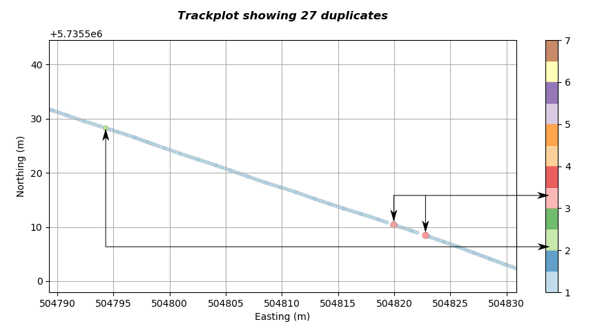
The number of repeats is related to the colour map so we can determine the duplicate severity purely visually. We can use this method of colour coding to visually analyse complete lines visually. For the first figure it should now be possible to establish the duplicate occurrence along the line without even zooming.
The script also plots the coordinate of the major axis against the SEGY header trace number. This is useful if we want to rapidly establish (see Note) the trace numbers within the SEGY file that have bad navigation. The major axis is defined as the axis that contains the biggest dynamic range of either northings or eastings and will depend on the orientation of the line with respect to the North South axis. A plot of this sort is shown below.
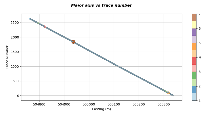
If we zoom into the upper left of the graph where we have identified that we have a location that has two repeated coordinates we get a plot similar to the one below.
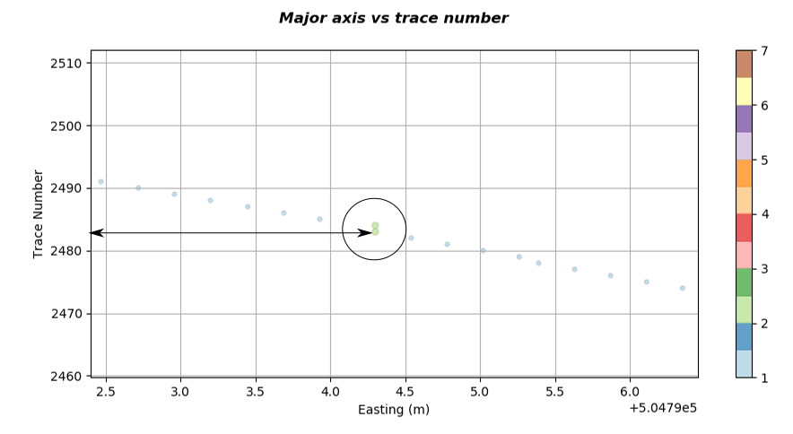
We can see that in the figure above the two repeated locations are at trace numbers 2483 and 2484. So now we have obtained the number and location of the problematic navigation with the file in a matter of seconds.
Note: The visualisation has been illustrated for a single file. In practice there may be hundreds of files that need examination. To reduce time the script can be run in batch mode; this produces a spreadsheet that summarises the number of duplicates present in any line. Inspection of the spreadsheet then determines which are problematic lines that may benefit from a more detailed visual analysis. A batch process to analyse about 4GB of SBP SEGY data may take about 30 minutes to run; however the process is far more accurate and pleasant than doing it manually.
A similar technique can be used to assess the consistency of SEGY navigation with respect to separation of traces. This method is particularly good at detecting locations along a line where an SBP may not have acquired data (missed shots). For high resolution SBP data this can be very difficult to determine by merely inspecting a seismic panel. The plot below shows the magnitude of distance between successive traces represented as a different sized circle and assigned a colour proportional to the magnitude.
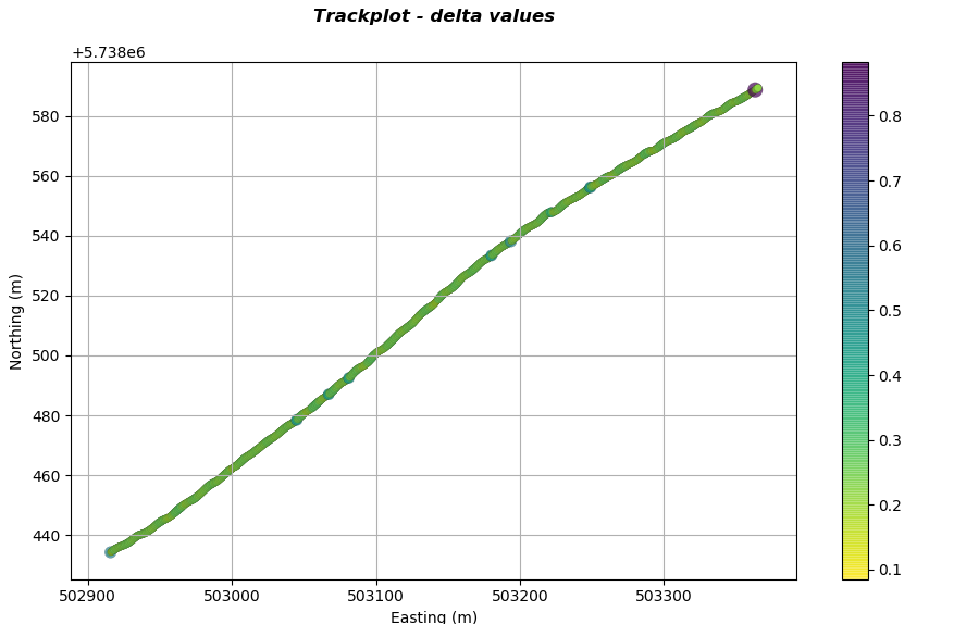
It is apparent that along the line there are regions of different colour and circle size. These locations are where there is inconsistent trace separation along the line. Zooming into the top right corner reveals more information regarding what is happening in this region as indicated in the plot below.
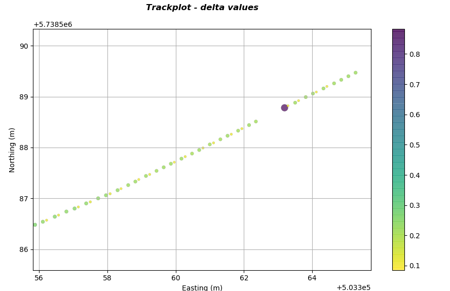
It is now apparent that the SBP system failed to record traces. In addition it can be observed that the system was firing/recording in a manner of pairs (whether this would be a significant issue is open to debate). If there is a requirement to have consistent and accurate navigation within the SBP SEGY headers then this method of QC provides a rapid methodology to implement it.
